Negroni Design System
Strategy / Research / Advocacy / Creative Direction / Design
BackgroundPinnacle is Group Nine’s proprietary tech platform that each brand is built on top of. When Group Nine formed, we spent a significant amount of time relaunching each brand on its own branch of Pinnacle. While we succeeded at unifying consumer product offerings, editorial & production workflows, and revenue capabilities, we quickly began to see major divergences across brands as new features were launched. With each brand essentially operating on its own codebase, there was no way to efficiently scale our output from one site to the next without manually rebuilding on each brand’s respective branch.
This meant redesigning, building, QAing, and supporting every product, on every site, manually…Not to mention the inevitable variances in UX/UI, making ongoing support even more fractured. It was completely unsustainable, and consumed a significant amount of resources, effectively blocking our lean team from investing in new impactful work.
Our team was stuck cyclically reinventing the wheel, effectively blocked from pursuing new initiatives.
With support from the VP of Product, I proposed implementing a multi-brand Design System that would help us achieve the scalability we so desperately needed. After a successful internal campaign winning over our CTO and VPs of Engineering, we partnered on approach and pitched the concept to executive leadership, ultimately earning approval to rebuild our entire web platform, Pinnacle 3, and introduce our first design system, now known as Negroni.
-
— Establish a completely new way of working that maximizes the impact of our nimble team, enabling them to address the needs of the brands we support, provide users with an experience they love, and empower our business to thrive.
— Create a single brand-agnostic library of components that can be arranged into purpose-driven patterns and themed to achieve brand expression.
— Launch Pinnacle v3 and migrate 1 brand to the new platform in a record-shattering 3 months.
-
— While Design Systems aren’t a foreign concept, our use-case was particularly unique in that we were building a single brand-agnostic system of components & patterns capable of being shared across multiple brands. This meant accounting for numerous theming libraries with vastly different visual languages as well as unique use-cases per brand. Achieving that variety without straying from our mission introduced a number of challenges as we developed our workflows.
— Earning the trust & approvals from stakeholders to cut unnecessary product features wasn’t always an easy conversation. As a Product Team we fundamentally believe that success starts with the User, and understanding how our readers engaged with our content helped us achieve the balance between a brand’s desire to customize each story and our audiences’ expectations for a simple, performant experience.
— As we took on each brand’s migration, we inevitably encountered numerous initiatives with conflicting timelines to our own. Rebrands, advertising campaigns, active partnerships, etc. It took clear and effective communication internally and externally to align our goals and relaunch successfully…in one case it meant migrating a brand to P3 with a library theme matching their existing branding and then updating that library to meet new branding, without requiring a single line of additional code.
-
— Research & Interviews. Excluding NowThis staff, we had a massive pool of candidates to interview by means of employees of other brands under Group Nine’s umbrella. After conducting simple surveys & questionnaires to rule out anyone with potential biases, we dug deep to learn the habits of how folks prefer to discover and engage with the news.
— Ideation & Exploration. I have never enjoyed coming into work more than in the weeks following our research & interview phase. Armed with performance data, consumption habits of our target demo, and an appetite to completely break convention I and my team conducted a series of design sprints each targeting one of 3 core types of content-buckets identified during our research phase: Latest Stories, Episodic Originals, Topics. Additionally, we wanted to create a video-viewing experience that would be just as passive as a social feed, easily flowing from one to the next, with the content under a spotlight.
— Proposals & Approvals. Due to the significance of a famously social-only brand launching a website, there were a number of stakeholder groups ranging from the NowThis editorial staff (who would ultimately be responsible for any production & staffing demands), to Sales, Marketing, and the CRO (who would need to bring this product to market & successfully capture numerous new revenue streams), to the CEO of Group Nine who was actively pursuing more potential acquisitions and mergers. This meant applying the same design-thinking we employed during our research & exploration phases: know your audience. We earned approvals on our concepts, content strategy, and editorial workflow proposals by catering our presentations and demos to the user & addressing head-on any concerns we knew were most likely to arise.
-
A Negroni is a simple cocktail made with equal parts of a floral Gin, sweetened by Vermouth, and balanced with a bitter aperitif called Campari.
Similarly, a Design System is a collection of UX patterns, themed by a brand’s visual language, that are unified by purpose.
Both are greater than the sum of their 3 equal parts, and invite experimentation to produce even more complex and interesting results.
At least one of them is delicious.
Everything you see below is the result of experimentation, evaluation, and evolution of how we worked, the tools we used, and solutions to challenges we faced along the way. It’s a testament to the incredible team that owned this project and invested significant energy into making it a reality.
I treasure the entire experience 🙏🏼
Our ApproachBuilding a brand-agnostic base system
Beyond the macro-level goals & challenges we were aiming to overcome, I recognized the opportunity to alleviate my team of brand-centric biases that have subconsciously influenced our approach. A brand-agnostic “base” system completely changed how my team worked and thought about our products. It gave us super powers:
— Laser focus. We removed any external motivation to alter how a product should work in order to meet a brand-specific expectation, it cleared our eyes and provided laser-focus throughout our design explorations and truly shifted attention entirely to achieving our goals through good quantifiable UX.
— X-Ray Vision. What initially began as a means to deliver specs and documentation to engineering became our primary medium for reviews with stakeholders. What began as purposefully undesigned base system became a system of hi-fi wireframes. Walking through brand-agnostic user flows & features repositioned our stakeholder reviews from over-analyzing fonts and colors to discussing how something works and whether or not our proposed approaches would help them achieve their goals.
— Super speed. Not only was it more efficient for designers to leverage existing components, but Engineers were able to rapidly build prototypes of our proposals using existing components. No waiting for brand approvals, new assets, or redundant specs. This allowed us to build products and immediately make them available to other brands with extreme agility.
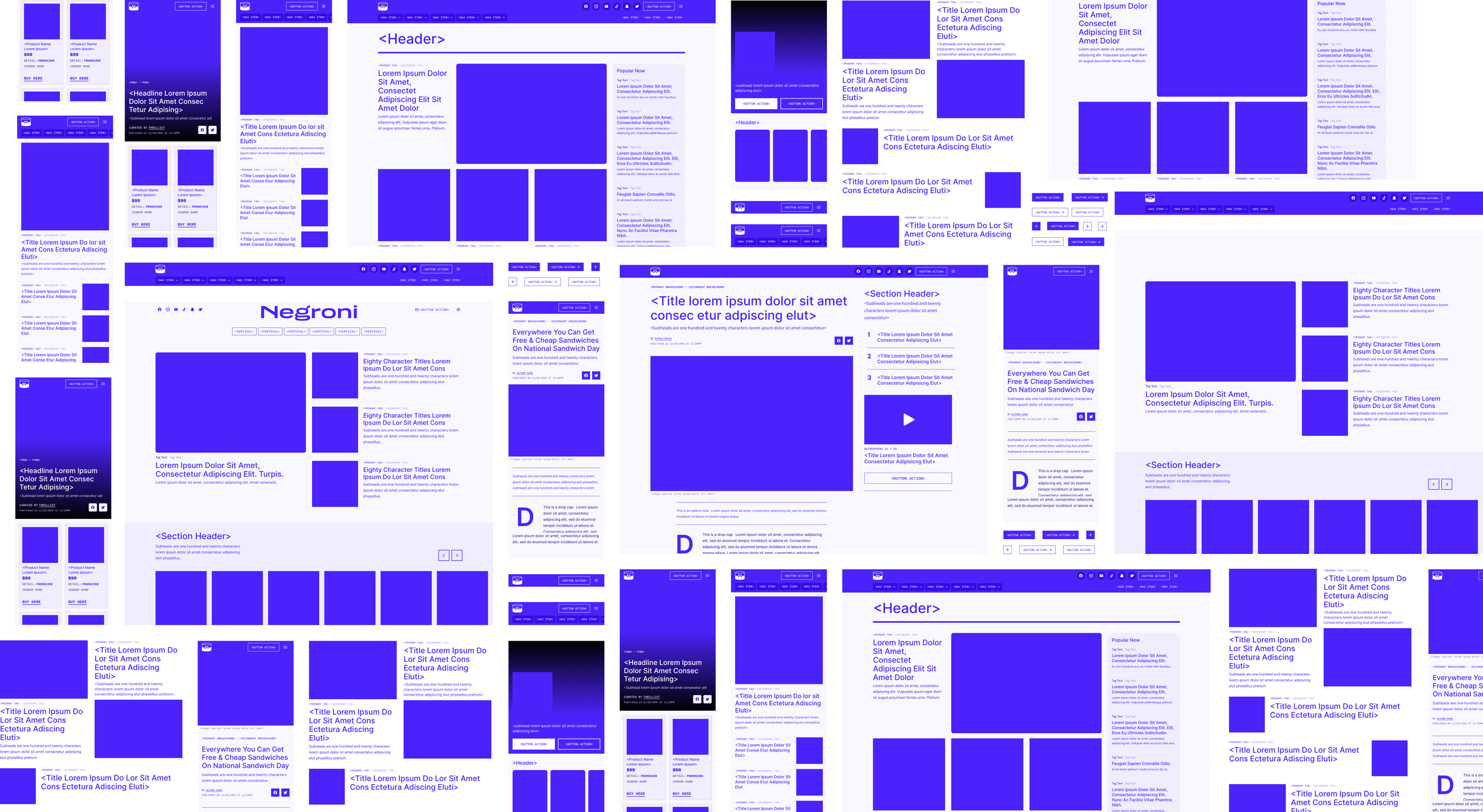
System ArchitectureBrand Toolkits
You can think of Toolkits as the materials used in construction. They are a translation of each brand’s style guide into a modern web best practices in mind. Typography, type scales, color palettes, iconography, z-indexes, border radii, grids, spacing, motion, accessibility, etc. Essentially all visual attributes of a brand are identified and made accessible via Figma Libraries, and help us achieve a number of goals.
— Design explorations became far more efficient while simultaneously eliminating formerly inevitable inconsistent visual treatments & bloated code.
— Updates to branding would be clearly communicated across the team & sweep through our designs with near-autonomy.
— Fostered a collaborative culture with brand design teams. This process gave them the opportunity to help shape what their brand’s products would look and feel like without injecting bias into how something worked.
— The introduction of Toolkits enabled complete brand expression while adhering to a unified system of Design Tokens across each brand.
-
Prior to introducing the concept of a toolkit layer “beneath” our Tokens, we worked solely out of a token library which introduced a few complications for us.
— We knew we needed an identical set of tokens across every brand’s library. But some brands had 5 primary colors, others only had 1. Some used different weights of a single font, others relied on 3 typefaces. In order to achieve the uniformity in our token libraries, we added too many layers of abstraction in how we created and named these tokens. Even for the folks who built the system, it was borderline unmanageable.
— Next were the technological limitations. In 2018 Design Systems weren’t natively supported by the software that ruled the industry. This introduced more hurdles for us to overcome with clunky multi-step processes. Eventually my team identified the capabilities available to us on a rising platform called Figma. We conducted some tests, identified the lift of migrating, and succeeded in earning approval to invest in this jump. It’s made a world of a difference and it reinforced to myself and my team that change is often a good thing.
At a macro level, this specific journey served as a perfect case study of why a Design System must be treated as it’s own product that requires quantifiable success metrics, evaluation, and iteration.
Core Components
If Toolkits are construction materials, Core Components can be thought of the foundation. These libraries include elements and components of small-to-medium complexity that in a vacuum maintain a specifically defined purpose. A button clicks, an input field accepts text, A navigation bar directs. The exact outcome of those actions become defined when applied to a specific scenario or pattern.
These core components are initially themed using the Toolkits, but once those visual treatments are finalized, we convert those values into semantically named Design Tokens. It’s this step where we introduce structural parity across the portfolio, ensuring if a token exists for one brand then it must exist for another. The values of that token can vary greatly to achieve brand expression.
The contents of this library are the basis for all future product explorations. These functionally-simple components can be combined in limitless ways to create more complex and interesting patterns and layouts.
Patterns & Layouts
This library contains the most complex purpose-driven patterns like map-based discovery, affiliate-driven content, on-site search, homepages, boilerplate layouts, etc.
It became a catalogue of product capabilities that we could easily share with stakeholders, reference for MVP scenarios, and identify gaps in product offerings that could be prioritized in future roadmaps.
From a practical standpoint, it enabled other product teams to rapidly design new flows & experiences.
Stakeholders were surveyed, performances were quantified, and features were audited. Dozens of redundant components, hundreds of inconsistent styles, and thousands of lines of code were unified into an MVP feature-set to use as a foundation across all brands.


Lessons & Learnings— Collaboration. The single greatest takeaway I have from this project has got to be the power of clear, communicative collaboration across disciplines. When we embarked on this journey we were operating under a ridiculously tight timeline to not only build this system, but rebuild our entire web platform. Product, Design, and Engineering were all heads down for 3 months marching towards this goal. We had stand-ups and touch-bases and sprint reviews to keep each other aligned, but a lot of assumptions were made by all parties along the way…assumptions that ended up not being very scalable.
As our system began powering multiple brands, we began to see points of friction that simply shouldn’t exist…over time these issues piled up and required addressing.
Before starting, we all took a moment to acknowledge the incredible amount of hard work that went into Pinnacle & Negroni, and recognized that this was an opportunity for us to collaborate and understand each other’s challenges and goals.
Designers learned more about engineering best practices and implementation. Engineers learned more about design’s intentions and goals. We found better ways of communicating specs, more efficient means of sharing documentation. The Venn diagram of design-owned vs engineering-owned began to merge more and more.
This moment in time was magical for our teams. It’s an experience I will take with me for the rest of my career.
— Empowerment & Trust. As the design lead (and senior-most individual contributor at the time) on this project, I felt a massive responsibility to own & understand as much of this product & process as possible. It was extremely new to me, and as a hands-on kind of learner I burdened myself with taking the lead on many aspects of the build, and delegated tasks once I felt I had a strong grasp on how they should behave. While we succeeded in launching a multi-brand system atop a new web platform, it was far from perfect and in need of iterations large & small. So much of the progress we’ve made since 2018 is owed to a more transparent process (that’s was inspired by design thinking processes I’ve implemented in our day-to-day operations) where I’ve entrusted new initiatives to my team, provided all the context possible, and set clear timelines and expectations. The team absolutely flourished, and the system is far more impactful because of the shared ownership.
— Advocacy. A design system is anything but a set-it-and-forget-it product. It requires constant measuring, support, and iteration. It’s an easy concept for people to nod their heads at and agree…but there was absolutely an underlying assumption of the opposite being true. Earning approvals to continue our investment (both in personnel, and timing) required a strategic approach. By applying design-thinking processes to how I advocate, I was able to secure appropriate staffing, software, and roadmap prioritization.
CreditsProduct Design
Chris Skae — Director of Product Design
Derek Springsteen — Senior Design Manager
Matt Sullivan — Product Designer
Joslin Lee — Product Designer
Product Management
Claire Albanese — Director of Product Management
Andrew Alburn — Senior Product Manager
Tara Kalmanson — Senior Product Manager
Engineering
Kwadwo Boateng — Senior Director of Engineering
Thomas Stang — Senior Engineering Manager
Sam O’donnell — Software Engineer
Chris Bradshaw — Software Engineer
NowThis News →
Strategy / Research / Direction / UX / UI“Homepage. Even the word sounds old. We bring the news to your social feed.” That simple brand-defining mission helped NowThis build a herculean one-of-a-kind brand that reaches over 80% of millennials in the US. It also meant their web experience needed to break the mold of traditional media just as much as their brand has.
Recommendation Lists & Content Tools →
Strategy / Research / Direction / UX / UIList-style recommendations are Group Nine’s most successful top-of-funnel content strategy. While they achieve their primary goal of generating significant traffic, they failed to achieve KPIs central to our success…All while requiring a significant amount of manual data collection & entry by our production teams, resulting in a lackluster experience for our readers.